The Article: 10 Web Design Trends You Need to Know in 2022
Design for the web is always changing and evolving.
That might give you the impression that website trends are unpredictable, but in fact, most design trends rise organically as priorities, as users and the web itself changes and grows.
While there are some fundamental principles of good web design, for 2022 we’re already seeing the next phase of design trends taking off. And many of these popular web design features are not due to the whims of digital agencies, but driven by user interactions.
So we’re taking a look at some of the top graphic design trends for 2022 and exploring why they’re on the rise.
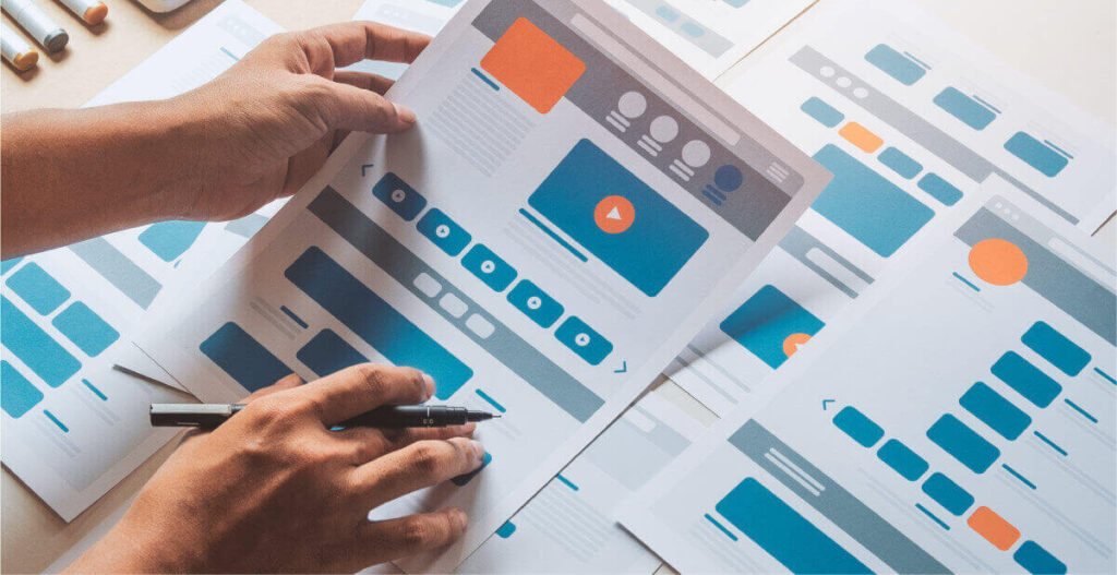
Website planning
I know what you’re thinking – how can planning be a web design trend?
But how you plan out your website is actually a huge factor in design, from creating UX driven features, functions and styles, to planning out how your content needs to be displayed.
Design thinking
In short, design thinking is about how we come up with creative solutions for problems, and is particularly significant when you’re designing web apps or systems.
It’s actually a term that’s been used for over 40 years in computing, usually in terms of creating user interfaces, but as UX becomes a more and more significant driver for both users and Google, design thinking is becoming an essential part of how we approach website design.
That’s why we favour bespoke web design over templates, as it allows us to plan the user interfaces to solve our clients’ problems from the ground up.
Content design
Content design is the process of creating the right content for a user, which sounds very simple, but is actually a very in-depth process that involves a lot of research, planning and user experience expertise.
Content design is incredibly valuable, as it gives designers the structure they need to create interesting, creative designs that complement the messaging and user journey.
It also means you’re considering the SEO and UX elements of your website from the very start of the planning process and building that into both the content and the design.
Content design lays the foundations for the rest of the team to build upon, from the designers and developers to the SEO and marketing team, and a great content designer has to consider all of these elements when planning the content and structure of a page.
But with this foundation, it enables you to keep the user’s experience in focus through every part of your project. And as we’ve already discussed, with UX being the absolute cornerstone of modern website design, it’s easy to see why content design is becoming so significant as a website trend.

Design styles
You may not have heard of memphis design, but you’ve almost certainly seen it somewhere! This style was established way back in the 80s and involves bright colours and abstract graphic shapes to create fun, engaging visuals.
Memphis design elements are a great way to introduce graphics around, underneath and over other parts of your design such as text and images.
It’s also a great way to tie together different sections of a website, and maintain a fantastic visual flow as you scroll.
Asymmetry
Perfect balance is something that digital designers often demand, but slowly that’s giving way to asymmetrical layouts that bring a more creative, less constrictive flow to a website.
That’s not to say that the grid is dead! But designers are becoming more open to a visual style that draws the eye organically through a site and using creative layouts that aren’t restricted to a classic grid layout.
Asymmetry is also being driven by the rise in content design, as designers aren’t creating visuals in a vacuum, they’re able to base them on fully prepared and designed content.
With that foundation, there’s actually a lot more freedom to create something visually unique, as designers aren’t stuck with a format that needs to work with whatever content they may be given after the fact.
Material Design and Material UI
Material design is a system created by Google to help designers and developers create intuitive, adaptable web products that have a consistent user experience across all devices and browsers.
Its look is inspired by the real world, from the paper textures of printed materials to how real-life products cast shadows and reflect light.
This framework is backed up by a repository called Material UI, where you can access or create react components you can use to build your product, so you can make sure there’s a consistent experience for your user.
You can stick to the instantly recognisable material design styles as established by Google, or you can create your own using their framework.
This approach to design is becoming widely used by companies from Nasa to Netflix, and is particularly useful if you are creating a prototype or MVP for a website or app.
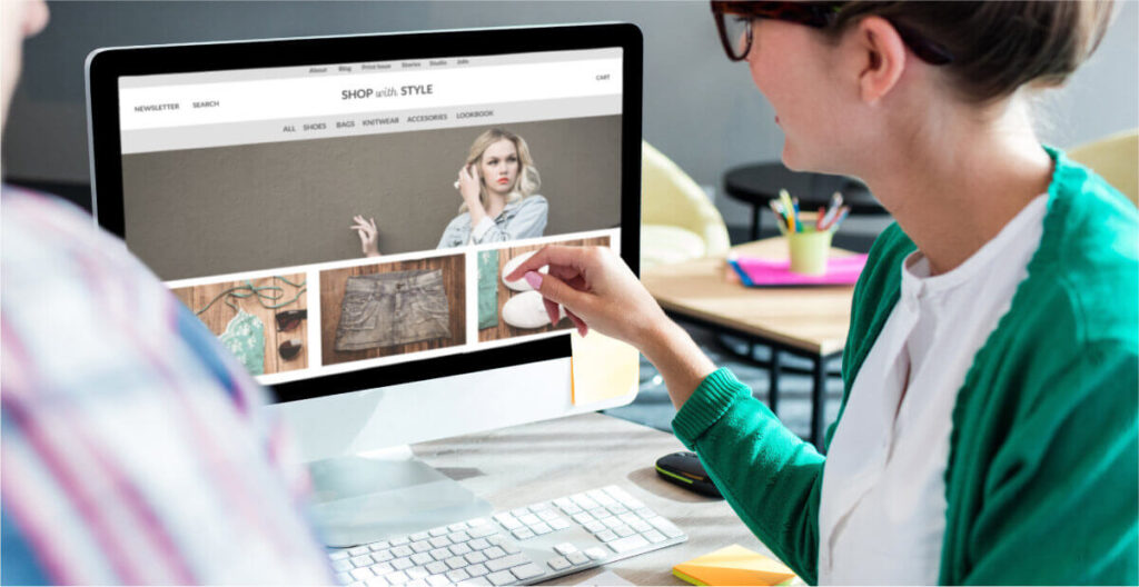
Web design images
Everyone knows that website imagery can make or break a great design.
Last year we saw some new trends emerging that move away from stock and realistic photography, making way for illustration, graphics, and heavily stylised pictures, and this has carried on into 2022.
Illustration
Realistic photography has always played a big part in modern web design. Whether clients have opted for stock images, taken their own or used a photographer, the vast majority of pictures have been based in realism.
But now we’re seeing more sites moving away from this style, in favour of using sketch style illustrations and line art.
Sometimes these are used as the only image style on site, sometimes they’re part of the background elements, and sometimes they’re used alongside and even over realistic photography.
This trend enables designers to change up ordinary images, breathing new life into them and making them feel unique.
Text only headers
In the last couple of years, typographical design has become more and more popular – a trend that looks set to continue into 2022.
Text only headers are when designers move away from imagery and visuals, and look to create unique and innovative typography styles.
Sometimes that’s as straightforward as a bold font. Sometimes it’s a more intricate text-based design. But, for both approaches, it’s the typography that is the focal point.
Web design features
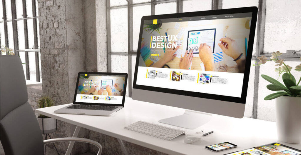
Of course, web design trends aren’t just about colours, text and images, there’s also a whole treasure trove of features that can be woven into a design.
Microinteractions
Microinteractions are the small, subtle animations and changes that happen when a user does something on your site.
They can be a special animation as someone completes a form, a transition in a gallery, or maybe movement that happens as you scroll.
Great microinteractions improve the user experience functionally and emotionally, by guiding users to perform certain actions on the site, but also by making those actions much more enjoyable and memorable.
Accessibility
While microinteractions are the sexy side of design, website accessibility is often thought of as purely functional.
But it’s a common mistake to assume that an accessible website can’t also be beautiful and creative. You just need to ensure that you’re thinking of your users with disabilities, alongside those without.
In the last few years accessibility has changed from being an additional feature to a necessity.
Modular design
Whilst the most creative sites usually come from giving your agency free rein, many clients out there still want direct control of their website. This can be tricky to achieve without resorting to restrictive templates, bloaty platforms, or having to create a whole website builder system.
That’s where modular design comes in.
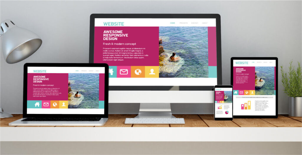
With a modular design, we create a series of different elements, layouts, and sections, that can be put together in a variety of ways.
It’s the perfect balance for a client who wants and needs a bespoke design, but also knows they want the freedom to expand their site when they need to.
Web design that’s bang on trend
We hope this has given you some inspiration for how to keep your web design fresh over the coming year. While web design styles and trends are ever-evolving, it’s important to keep the key web design principles in mind and put your audience and their experience at the heart of your design.
If you’re looking to create a bespoke web design, product or app that steals the show in 2022 (and beyond), we’d love to hear from you.
View the original article.

