The importance of colour in branding cannot be underestimated. Companies spend hours of time and millions of pounds on choosing the exact shade or colour to represent their brand. So much so, that companies like Ikea and Coke have paid for a colour to be created just for them.
Is it worth it?
In a study titled “Impact of Color on Marketing”, researchers found that up to 90% of snap judgements made about products are based on colour alone. So yes, it seems to be worth it.
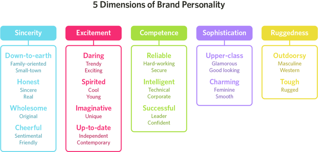
Colours influence what customers think of the personality of a product, which is essentially the ‘branding intention;’ i.e. what message do you want to give your customers about the values and ethos of your company?
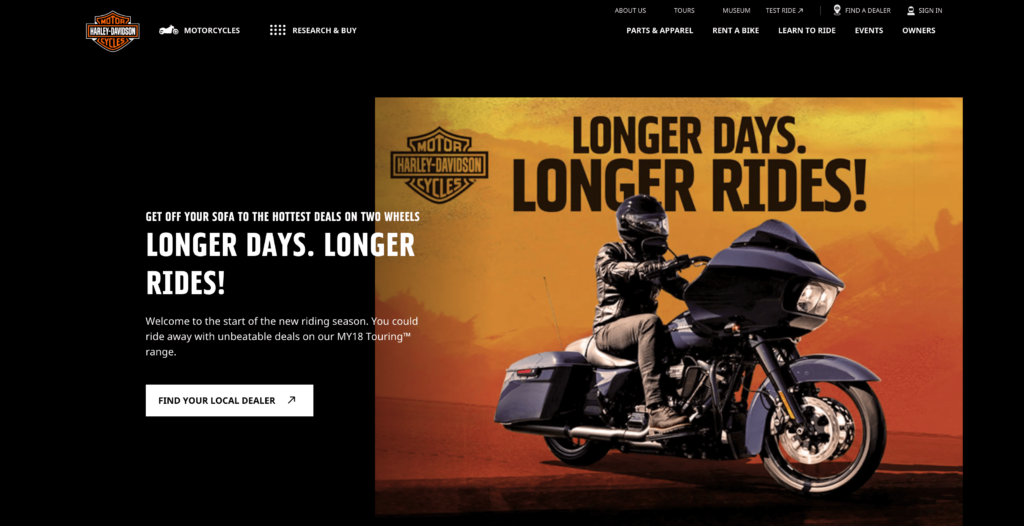
What is interesting is that whilst specific colours are associated with specific sentiments, the relationship between brands and colour depends on what is known as ‘perceived appropriateness’ of the colour being used for that product or service. For example, take the case of Harley Davidson. Harley’s are perceived to be rugged, tough and masculine. Its brand colours are black and a deep orange as seen in the logo. What if they had chosen colours like pink and yellow? Their rugged image would have probably fallen flat.
It is true that colours have certain characteristics, but it’s important to use them intelligently as colour appropriateness is thought to be more important than the actual colour itself.
Let’s take a step back and understand the basics of colour psychology. What characteristics are associated with different colours according to Creative Bloq Magazine.
Red
The colour of anger and danger, but also warmth and passion. And since it’s also scientifically proven to increase your heart rate and raise your blood pressure, it’s a bold choice to use it extensively. The most recognisable brands that use this colour are Coca Cola, Santa Claus and Vodafone amongst others.
Orange
Bright, fun and friendly, orange has a playful, childlike appeal. Harley Davidson uses it along with black to demonstrate the fun aspect of its bikes. Other companies that use orange are EasyJet, Orange Mobile and B&Q.
Yellow
Positive, sunny and optimistic, yellow is energetic and eye-catching – and particularly effective for point-of-sale messaging, as it’s proven to catch the eye quicker than any other colour. Which companies do you associate with yellow? McDonalds, DHL and Warner Brothers. You might notice that in all these, yellow is used with another colour; as an accent rather than a main colour.
Green
Green is an emotionally positive colour, signifying growth and rebirth and, of course, nature. It represents stability and endurance, but it also prosperity and abundance, and taken to the extreme it can be a colour of wealth and luxury. Companies that use green in their branding include Harrods (a very specific rich shade of green), Starbucks and Whole Foods.
Blue
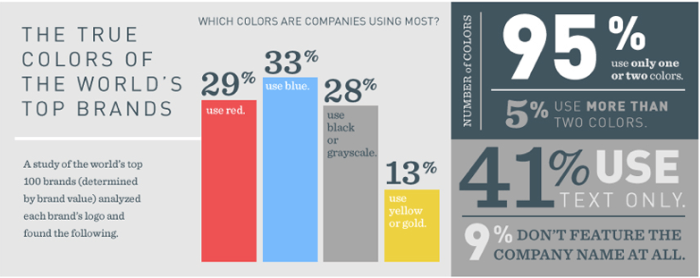
Blue is by far the most popular colour used in branding, either as the primary colour or as an accent colour. Blue is a cool, clear colour which has a trustworthy, dependable feel, and is often the colour of choice for financial institutions as a result – notably Barclays, the NHS, Linkedin and even Facebook.
Purple
The colour of royalty…Pale lavender has a nostalgic, sentimental feel, whereas richer, darker purple has a sophisticated tone often linked with royalty. The brand that immediately comes to mind when we think of purple is Cadbury’s Daily Milk. Their iconic purple colour is recognised anywhere in the world and stands for a certain richness, class and indulgence.
Brown
Earthy, simple and evocative of honesty and simplicity, brown (as well as green) is often used by organic companies to emphasise their links to the soil – although outside of this sector it’s largely avoided in a branding context due to potential negative connotations with ‘dirt’, although this of course depends on the shade chosen. UPS, M&M’s, and Hersheys.
Pink
The level of intensity with which pink is used makes a big difference to its impact. Paler shades are often have ‘girly’ associations, while dusty pinks have a sentimental tone – both uses are relatively clichéd and absolutely everywhere, so standout with that goal in mind is next to impossible. T-Mobile and Lastminute.com and Breast Cancer awareness are the brands that come to mind when we think pink.
Black
It has a bold, powerful, classic effect that feels confident and sophisticated for more expensive products. Harley Davidson, Hotel Chocolat and Guinness have black as their primary logo colour.
White
Last but not least, white. Simplicity and purity are the overwhelming associations with white in branding, and its brightness immediately catches the eye when used in signage. Baby and healthcare products regularly make use of it, and as a result, standout is tricky. Apple is the most famous brand that uses white in its branding.
At Somer Design, we understand how colours work with different products and service and how your target audience will view your brand personality based on the colours used. As branding experts, we will share our views and insights based on your company’s products/services, values, and ethos on the most effective and ‘appropriate’ colours for your company.
Does your logo and branding need an upgrade? We specialise in re-branding and can help you to redefine the way you connect with your audience. Throughout the design, development, and marketing process, our clients don’t just gain premium branding materials and online assets, but they also learn a lot about their business and their purpose.
Learn more about our branding services or book a call to speak with our founder, Caroline.

