Like interior design and fashion, web design trends are constantly evolving. Crowded and intricate designs are out, and modern, spacious, and minimal design is in!

We’ve put together a list of five of the websites we’ve recently designed, helping you to understand the current trends and form a better understanding of what you envision for your website.
- Aspire UK
Profile
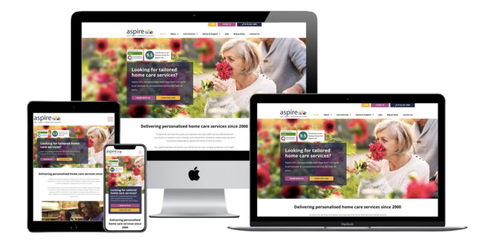
Aspire UK is a leading provider of home care services across the UK. For over 20 years, they’ve helped families care for their loved ones through the delivery of tailored support. The Aspire UK team specialises in dementia care, care for the elderly, and more. Their website showcases Aspire’s various services while providing helpful information about care at home.
The result
What we love
- The use of warm and inviting colours.
- The imagery highlights the quality of their service and the happiness of their service users.
- It showcases their team and various career opportunities.
- The design is modern, stylish, and appeals to a wide audience.
- The content is benefit-driven, highlighting how service users can maintain their independence.
- LCCH International
Profile
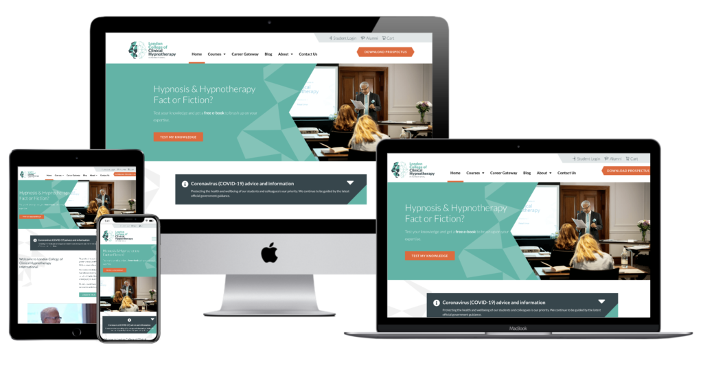
The team at LCCH International are the UK’s leading experts in hypnotherapy training. Their rebranded website highlights information about their courses, the career of a hypnotherapist, and insight into hypnosis.
The design
What we love
- Their fresh logo and the engaging colour palette.
- How their content focuses on the benefits of hypnotherapy as well as the benefits of taking a course.
- The clear contact, download prospect, and messaging buttons that make it easy to engage.
- The use of space, bold lines, and graphics to highlight certain features.
- Bold Leap
Profile
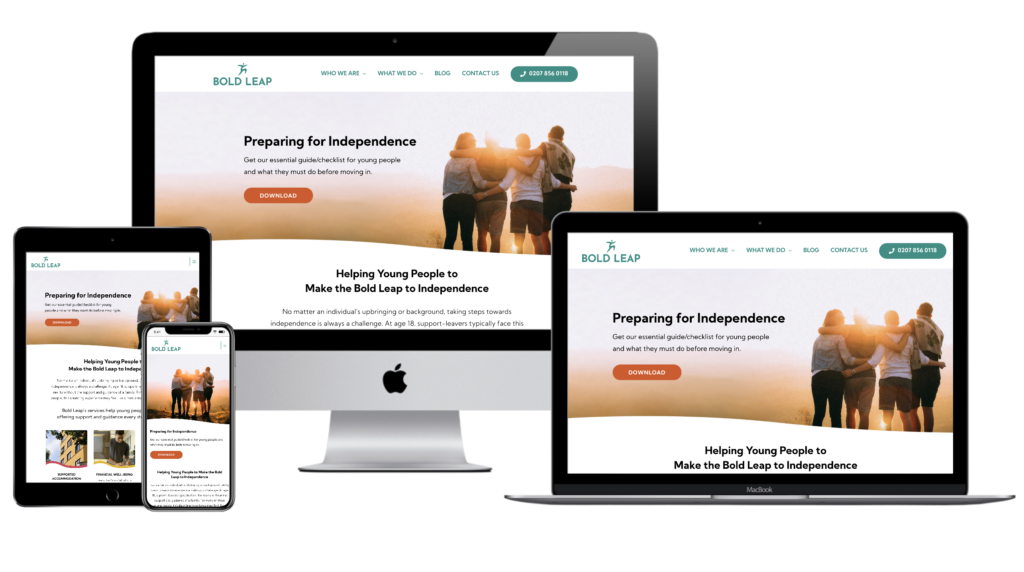
Bold Leap provides guidance and support to young people during their transition to adulthood and independence. They help young people across London to find housing, employment, education, and support. Their website is engaging, colourful, and inspirational.
The design
What we love
- The bright colours and design.
- How the content highlights Peter’s story.
- Their practical, helpful, and high value lead magnet.
- The fun and friendly, yet professional tone of the site.
- The inspirational imagery.
- bluepath
Profile
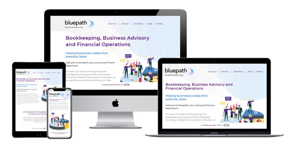
bluepath is a bookkeeping and financial advisory company. They offer a complete and integrated approach to finance and operations and have clients across the UK. Their website showcases their various services, while highlighting their credentials, recent projects, and testimonials.
The design
What we love
- The engaging graphics, branded to suit bluepath.
- Their informative and engaging content.
- The modern, bright, and stylish design.
- Somer Design
Profile
We love our new website, so we thought we’d include it in this list! If you’re reading this blog, you probably know a little bit about Somer Design. But in case you don’t, here’s a quick run-down of what we do.
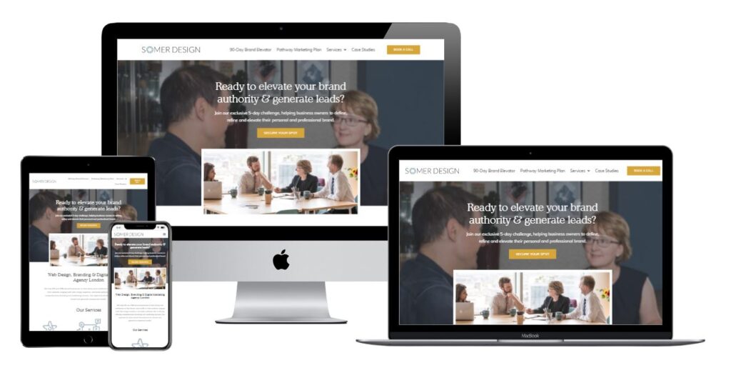
We’re a branding, web design, and digital marketing agency offering services to help businesses communicate their WHY and make an impact online. Our new website highlights our services, unique offerings, and recent work.
The design
What we love
- The sophisticated colour palette.
- Our custom imagery.
- How the content not just what we do, but how we can help.
- The focus on our 5 Day Challenge.
What are your web design likes and dislikes?
We hope that this article helped you to define some of your likes and dislikes in web design. Maybe you loved the warmth of Aspire UK or the creativity of bluepath. Or perhaps you loved the story of Bold Leap or the organisation of the Somer Design site. We’d love to hear your favourite aspects of each!
Understanding what you like can certainly help the web design process. If you’re ready to get started on a website for your business, get in touch with us today.
Learn more about: Web Design


